Client
Revel
Date
02/2019
Tools
Figma, Adobe CC
Role
A detailed set of rules and guidelines dictating the visual and spoken behavior of the Revel brand.
Revel wordmark animation
Overview
Revel began as a small for-rent company in Brooklyn with only a few Mopeds, quickly found success and began aiming for larger and grander goals... with little but a logo and a color. Facing incredible growth, Revel needed a robust Brand framework that would present us with a recognizable brand and actionable guidelines to improve workflow. As a new, but growing company, having a bold and visible brand was vital to improve recognition. This rapid growth, would also inevitably lead to rapid designing and creation, highlighting the need for a succinct and clear system all could follow to maintain consistency.
Approach
Identifying, simplifying and amplifying key brand elements that most represent the product meant we could ensure our brand would quickly become synonymous with our product category(electric transportation), and that folks would easily identify us in the ocean of distraction that are the New York City streets. This minimalist approach, would also be easier for a growing company to adapt, implement & scale internally, while allowing creatives to generate and deploy assets quickly while still maintaining consistency.
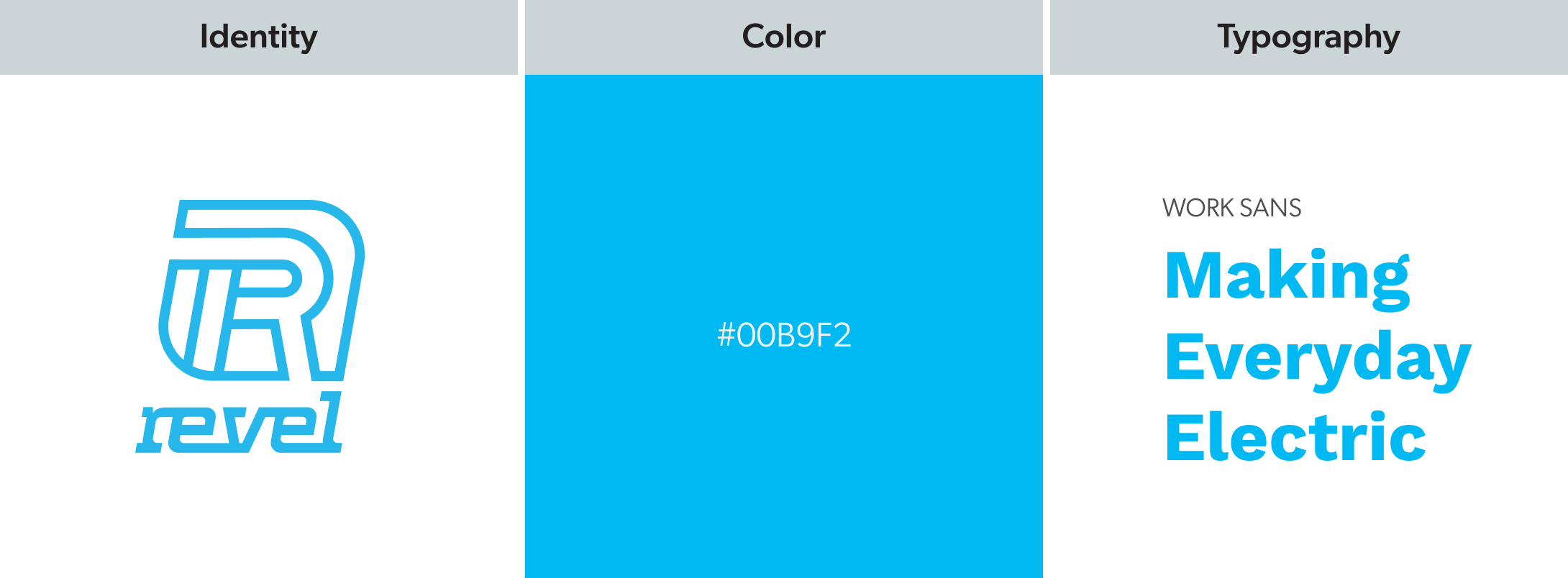
Key elements representative of the brand
Identity
To ensure maximum brand visibility, I recommended that we focus primarily on displaying our wordmark across all branding instances whenever possible — exposing audiences to our name would be more beneficial than a logo they've never seen before.
Color
I chose to pursue the idea that a very specific color should be associated with our brand and that it should be one that is bold but welcoming and distinctive from all the yellow and gray found in city streets. A bright blue would be highly visible, safe, and represent the vibrant personality of the brand.
Typography
Personality being of great importance to Revel, we chose to use Work Sans as our primary family due to it's quirky imperfections.
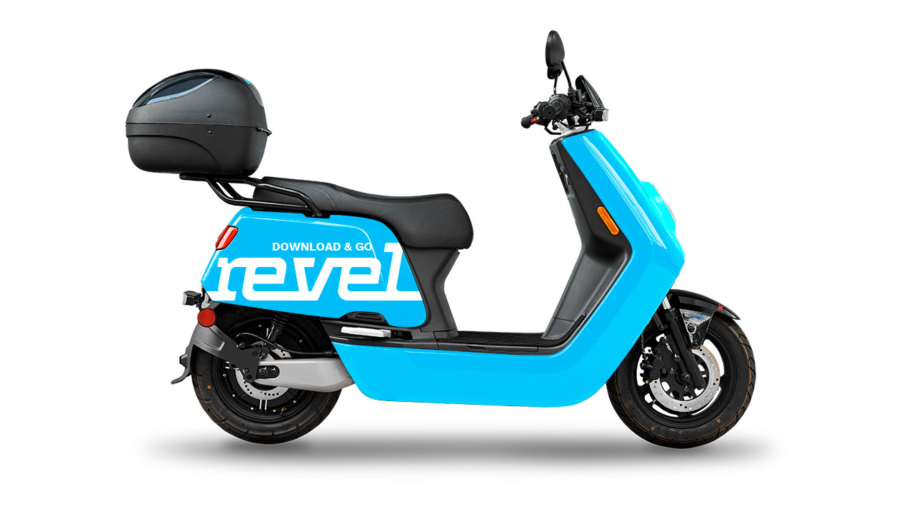
Moped vehicle design
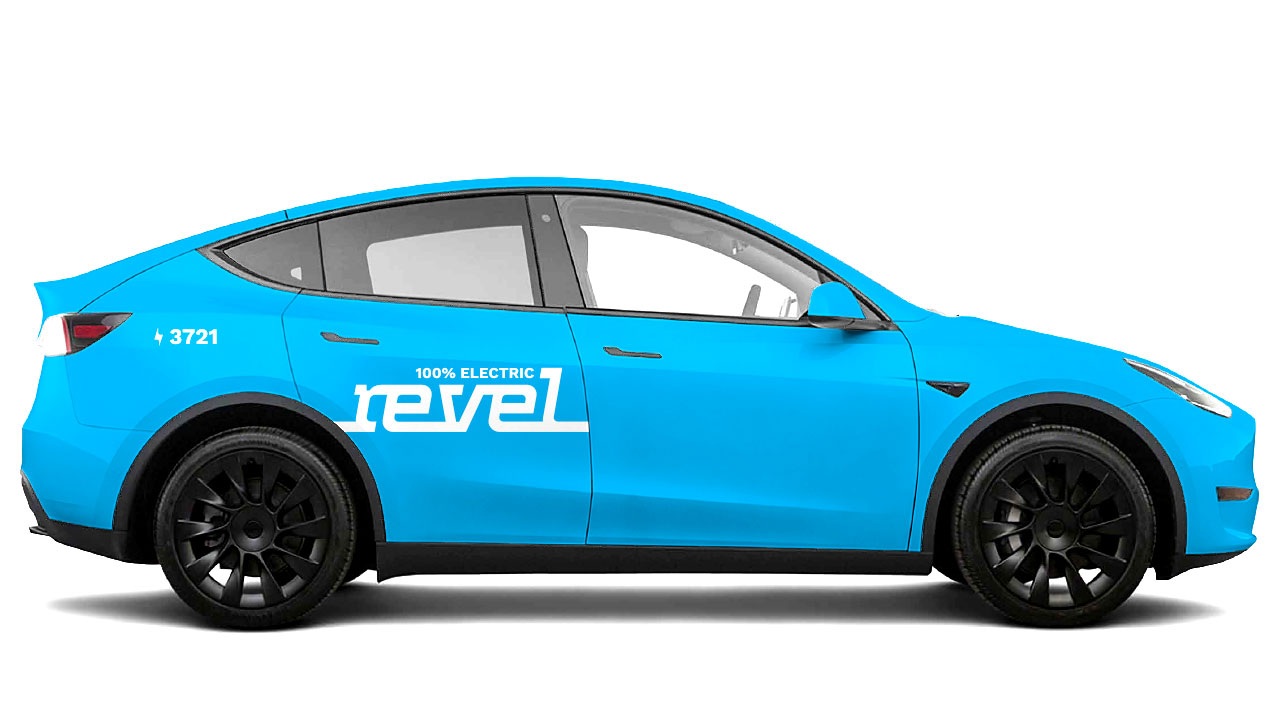
Tesla vehicle design

Superhub charger design
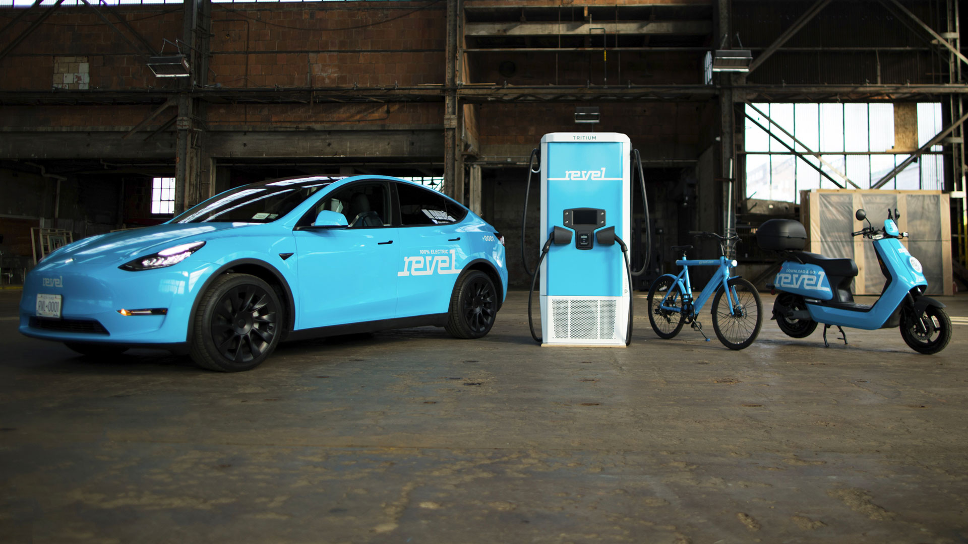
Family of Revel products

Tesla in-situ

Tesla and Moped in-situ
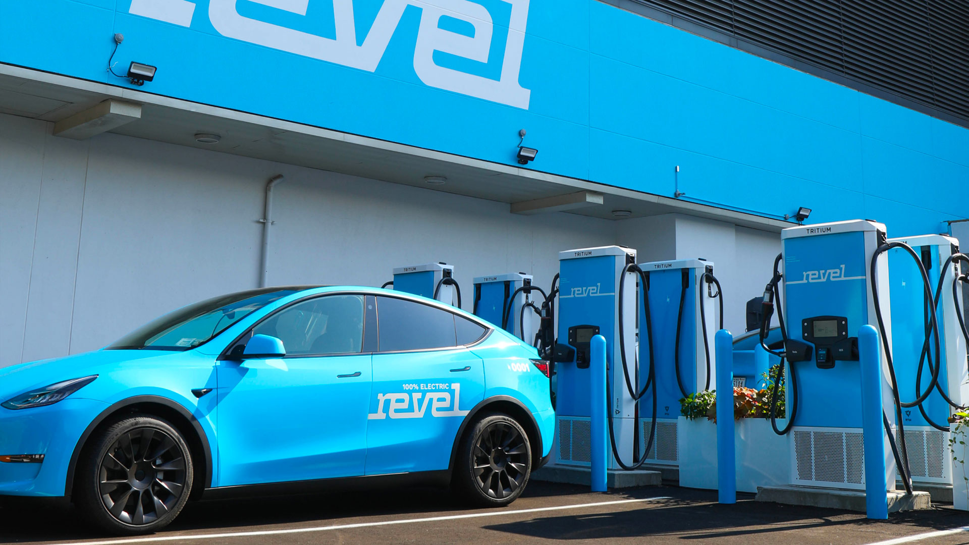
Tesla charging in a Revel Superhub
Branding on the Revel vehicles aims to amplify brand awareness by capitalizing on consistency and high visibility. The Revel Blue is a distincitive hue and the wordmark is highlighted in all of our products.
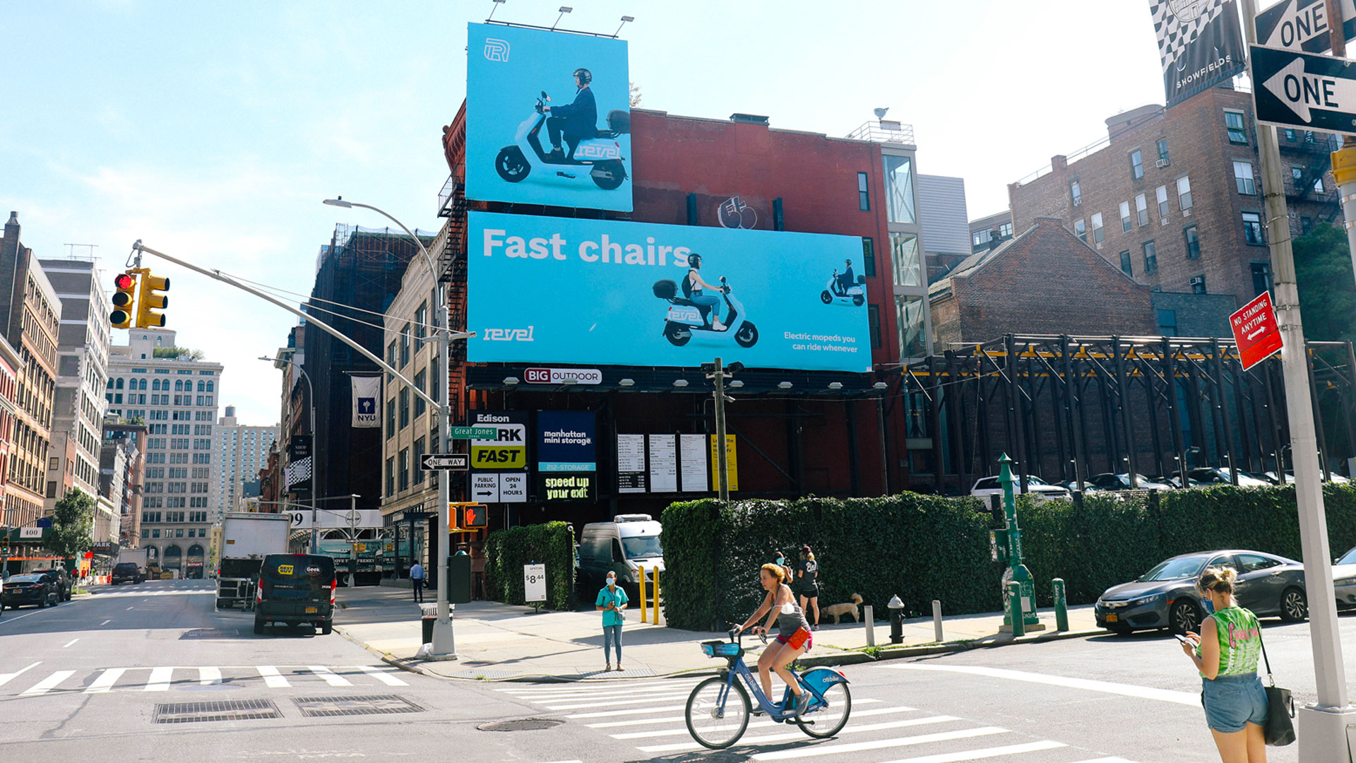
Moped OOH SoHo billboard

Moped OOH wheatpaste

Moped OOH Brooklyn billboard
The minimalist branding guidelines were carried across marketing assets, including out of home.

App intro screen

In-App communications
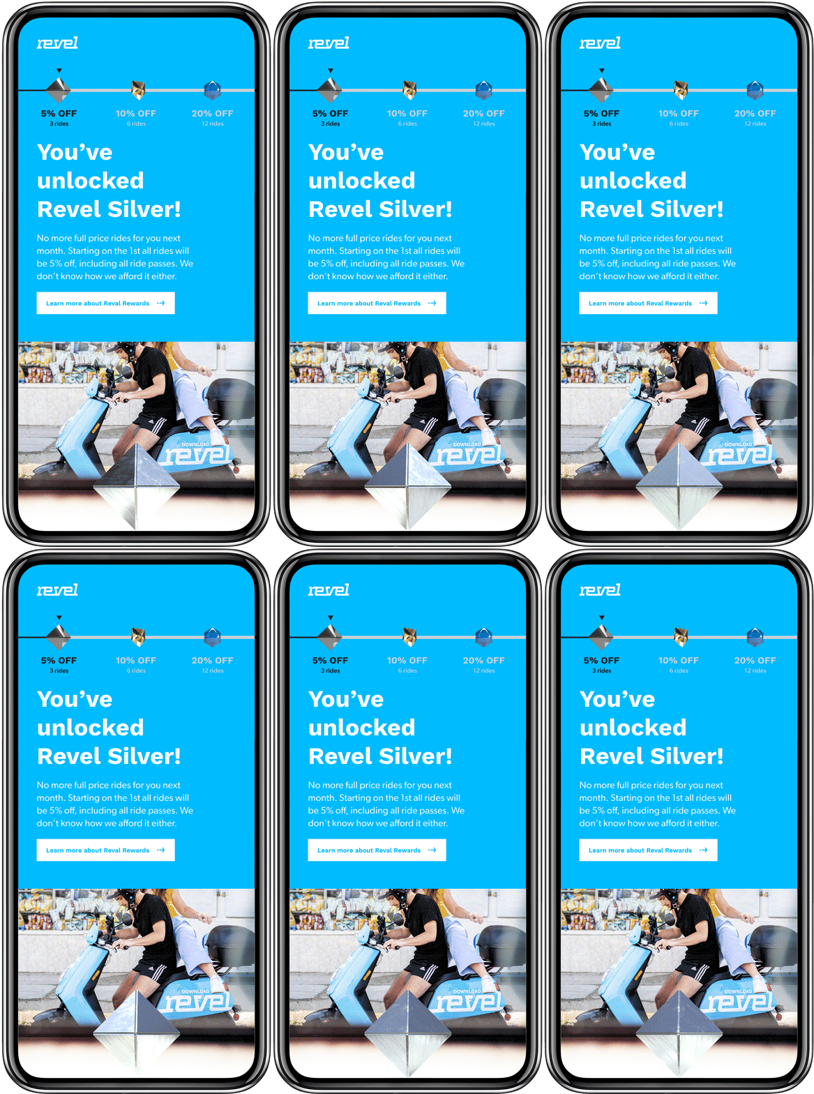
Email communications