Client
Uber
Date
04/2019
Tools
After Effects
Illustrator
Figma
Role
A motion system that highlights the Fun, Electric & Disruptive core values the JUMP brand stand for. The principles oulined below are carried throughout web, social and product.
Performance campaign to raise awareness of JUMP's availability on Uber
Overview
JUMP marketing research shows that most users enjoy riding our vehicles because they provide a faster and more fun way of going further. However while the boost and ease provided by our electric assist is one of our main value props, many didn't realize our vehicles were in fact electric. Further, we have great social engagement, particularly with assets involving motion. With this in mind, motion assets follow the principles of 'fast but smooth & always electric'.
Approach
Our fast expansion accross the globe called for the motion system to be templetized. By creating a easy to use pre-designed assets and editable files. This ensured teams across the world would be able to easily generate motion comps which followed all our principles and led to a visually unified JUMP brand. By presenting a visually unified front, the core message of "always fun and electric" would be present across all assets, regardless of who or where it was created.

16:9 Base Grid
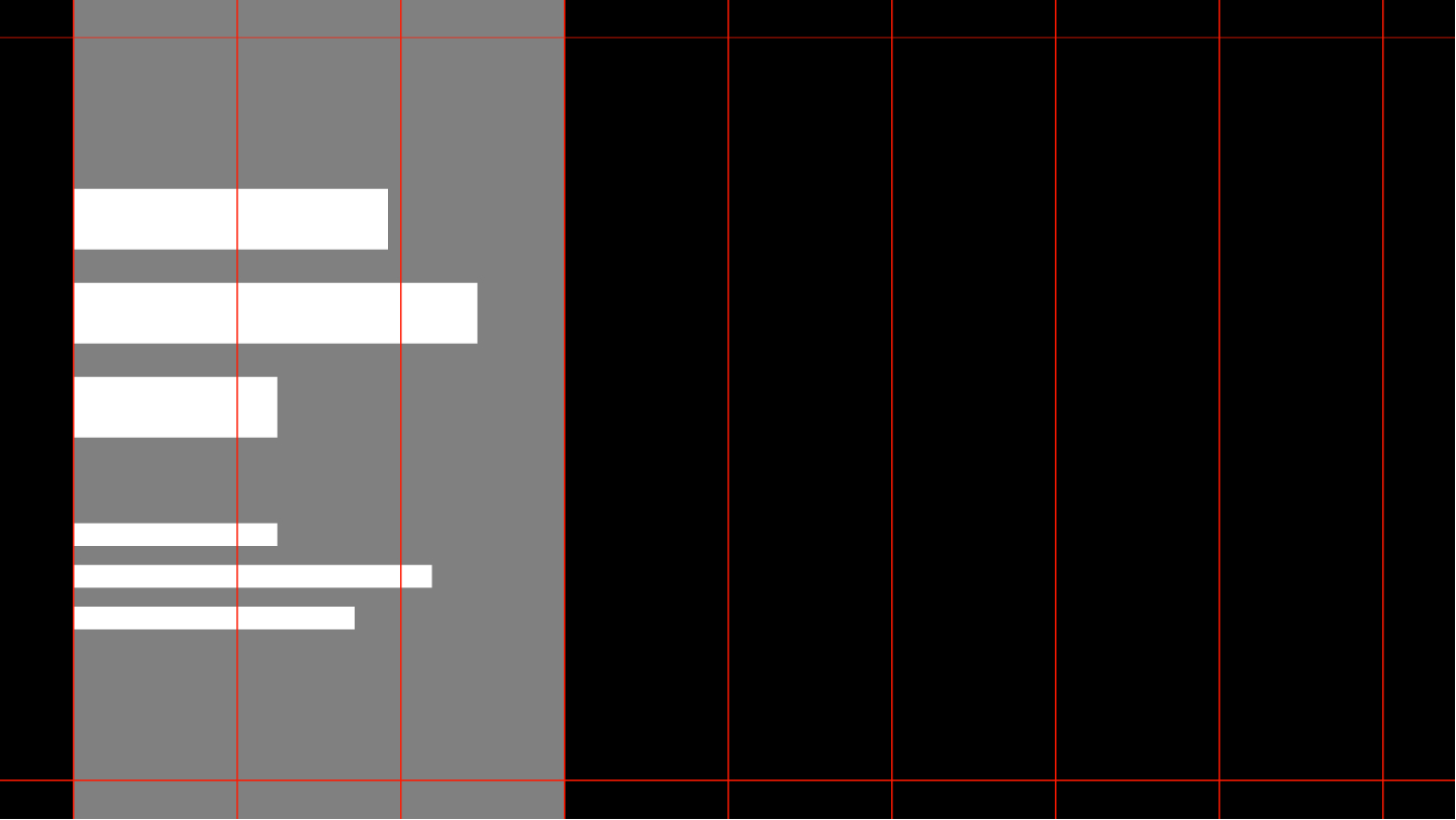
16:9 Left aligned Grid
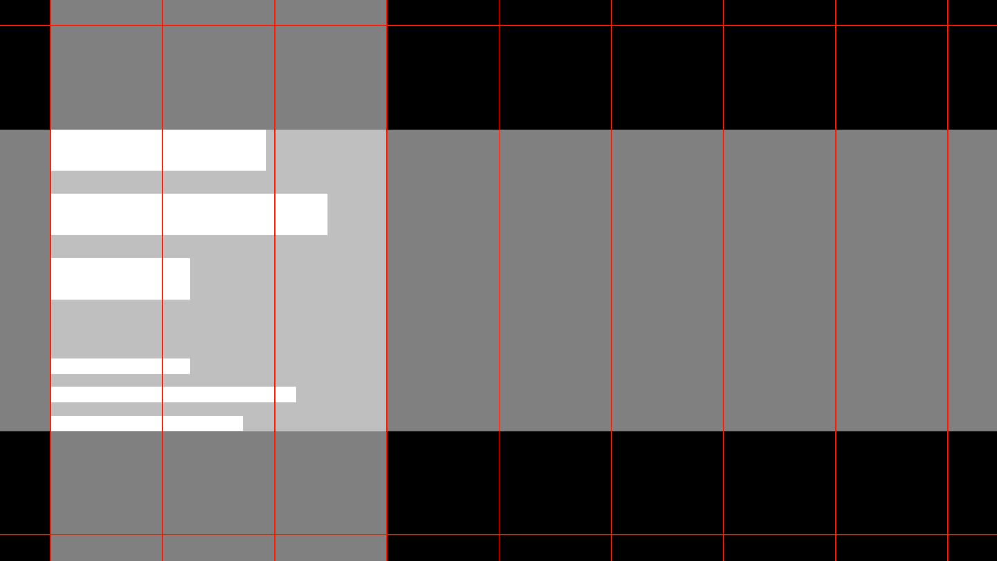
16:9 Middle aligned Grid

1:1 Base Grid
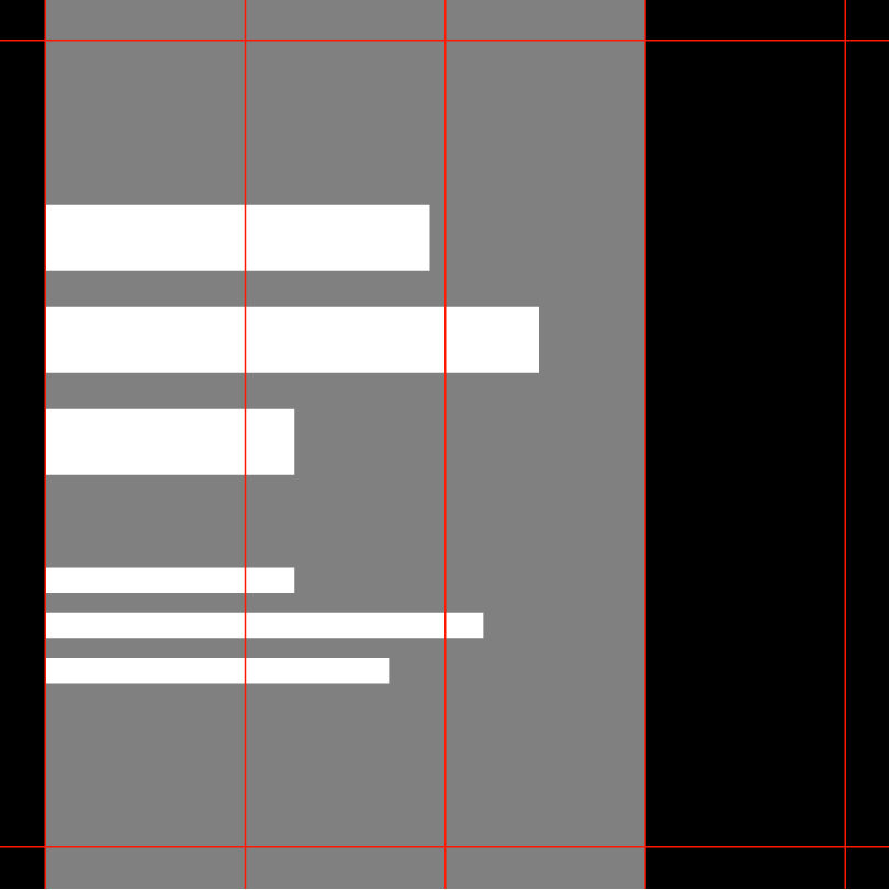
1:1 Left aligned Grid
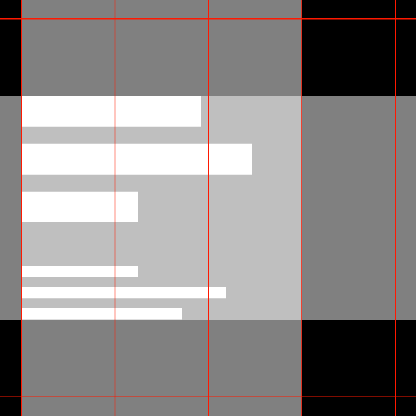
1:1 Middle aligned Grid
Grid
The 16:9 motion grid is split into 8 columns, with 5% margins and 0 gutters.
The 1:1 motion grid is split into 4 columns, with 5% margins and 0 gutters.
Copy and overlayed content should take no more than 1/3 of the 16:9 composition, and no less than 3/4 of the 1:1 composition. It should always be left aligned, and vertically centered.
The Hop • Single Line L
PLAY
The Hop • Single Line S
PLAY
The Hop • Multi Line
PLAY
Unlike Uber's more rigid text reveal which speaks to the more utalitarian nature of the brand, JUMP's incorporates a "hop" upon entrance and exit to highlight it's more playful hop on & go nature.
Title Card 1 • Hop over video
PLAY
Title Card 2 • Hop over cover
PLAY
Supers
PLAY
Short, to the point transitions where video and text animate simultanously. Designed in collaboration with our videographer to ensure rythm accross animation and video pace.
Bolt
PLAY
Bolt + Text
PLAY
Bolt + Media
PLAY