Client
Uber
Date
07/2019
Tools
Figma
Role
An atomic approach redesign of the Uber web system in order to succesfuly incorporate and scale the JUMP brand on Uber's web framework and CMS.
Uber vs JUMP Resposive Headers
Overview
After Uber acquired JUMP, we worked to bring the two brands together while finding synergies in order to come up with the most scalable solutions to conflicting identities. After identifying the ample resources and robust system Uber had developed, we decided to adapt and redesign in order to accomodate the JUMP brand, rather than brute-force it in. By taking this approach, we would ensure that the unique and valuable identity of JUMP would maintain it's presence online, while simultanously being able to live within the Uber CMS and utilize their vast resources.
Approach
Atomic Design allows for a bottom to top design approach. By re-thinking, redesigning and subsequently replacing the basic elements of the Uber system with JUMP ones instead, it created a ripple effect that ended up generating entirely different components and blocks through the entire system. While the main goal of the excersice was to establish JUMP's brand within an existing framework, I also wanted to ensure both brands were idetifiable as part of the same family by maintaining basic elements like the same 4px grid, spacing and using Uber Move as JUMP's secondary typeface.
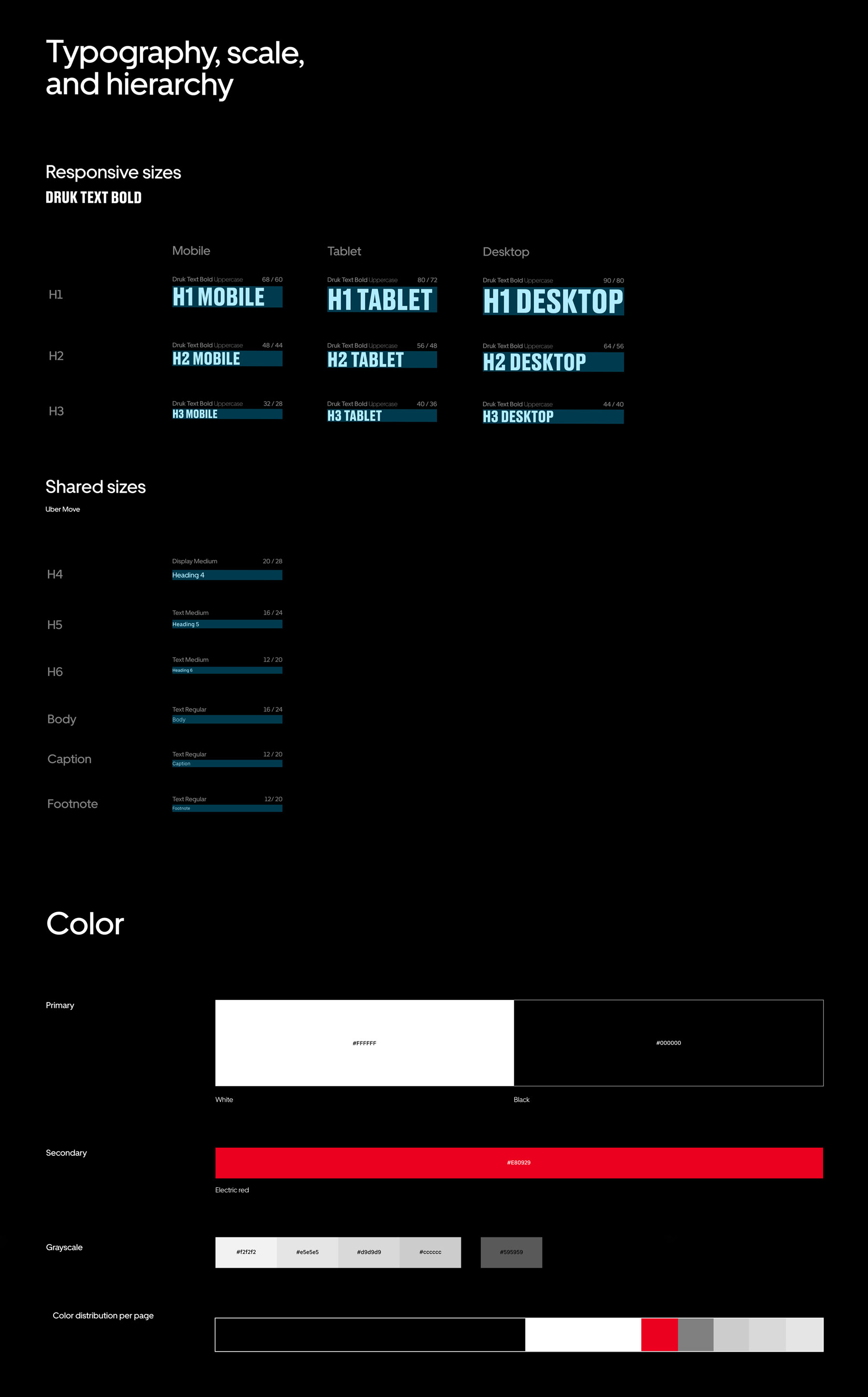
JUMP base Elements
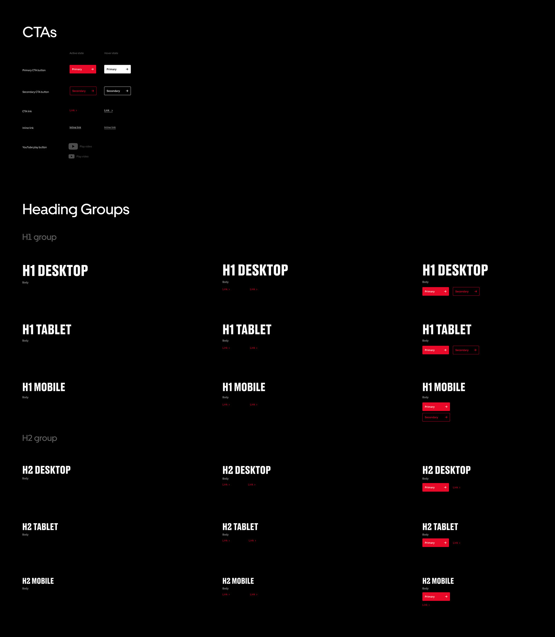
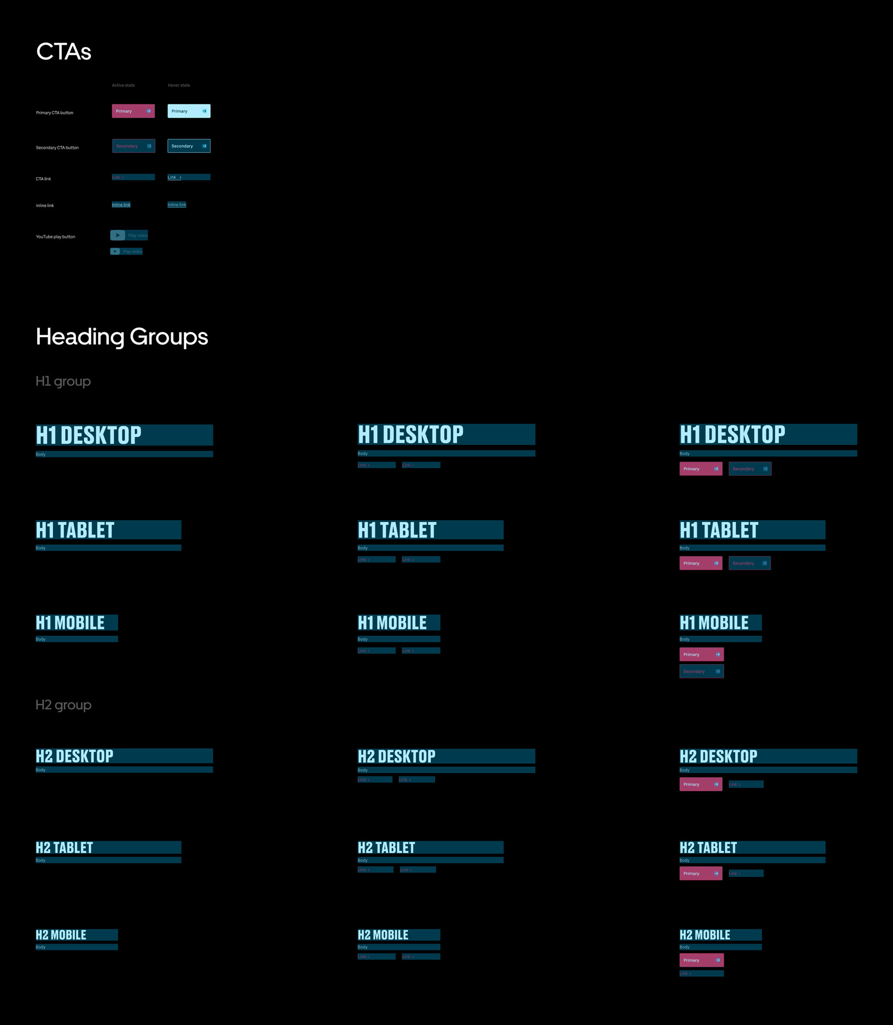
some JUMP Components
Grid
JUMP's main differentiators from Uber are it's primary typeface (Druk), primary color #E80929, and black as the predominant background color accross most web properties. These changes caused drastic diversions throughout the base system and ultimately generated an entirely different one which was more closely aligned with the JUMP brand.
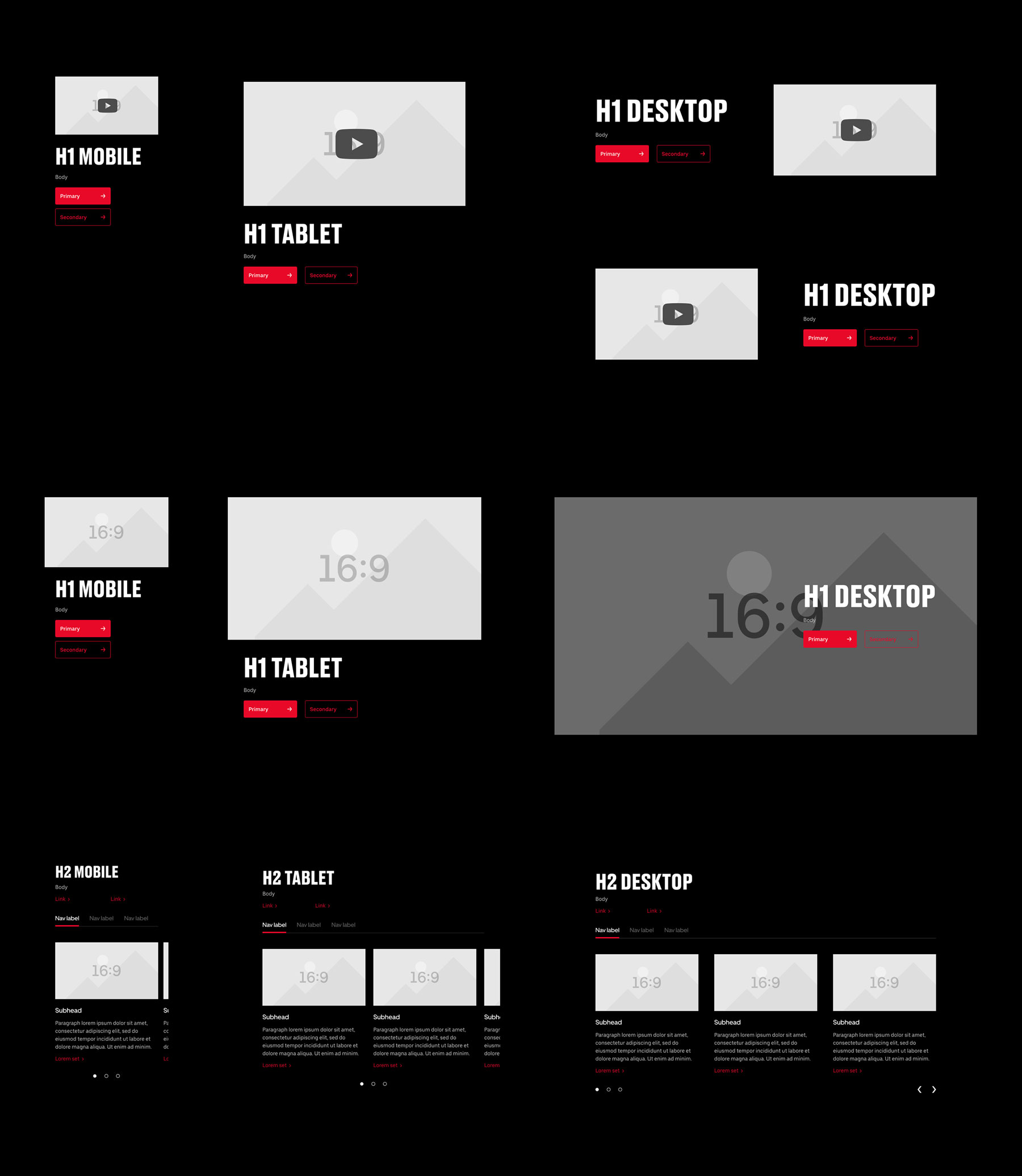
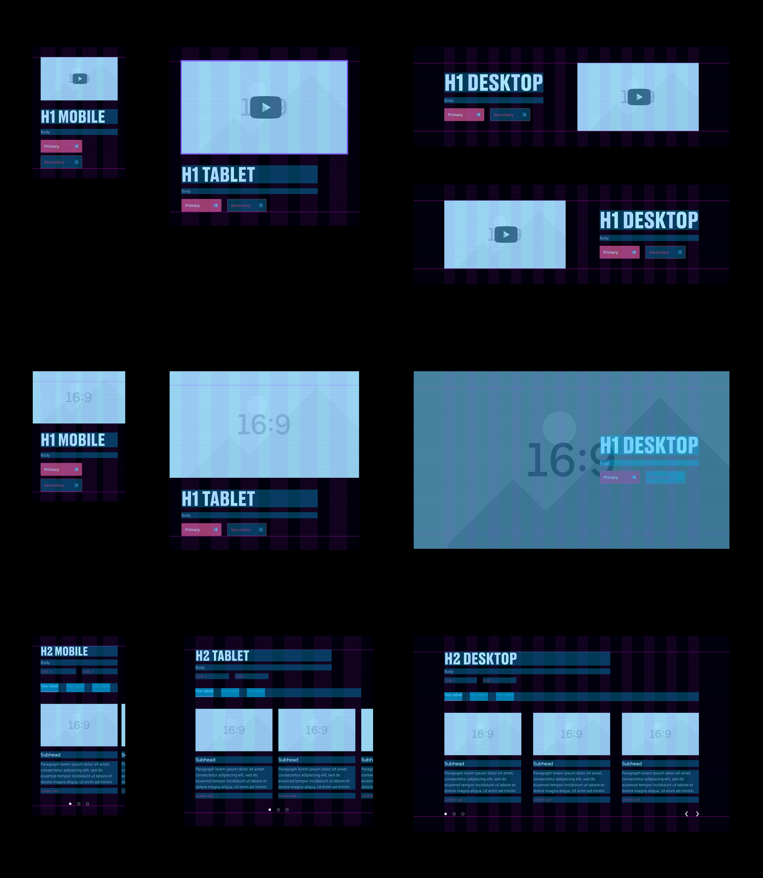
some JUMP Blocks
Grid
With Uber's ever growing stable of products and services, many of which develop their own brands and identities independent of Uber, the JUMP system redesign could serve as a framework to develop a theming function for the CMS. Allowing other brands to, like JUMP, take advantage of Uber's base web resources but still have a level of autonomy over their web presence and still be part of the same family.
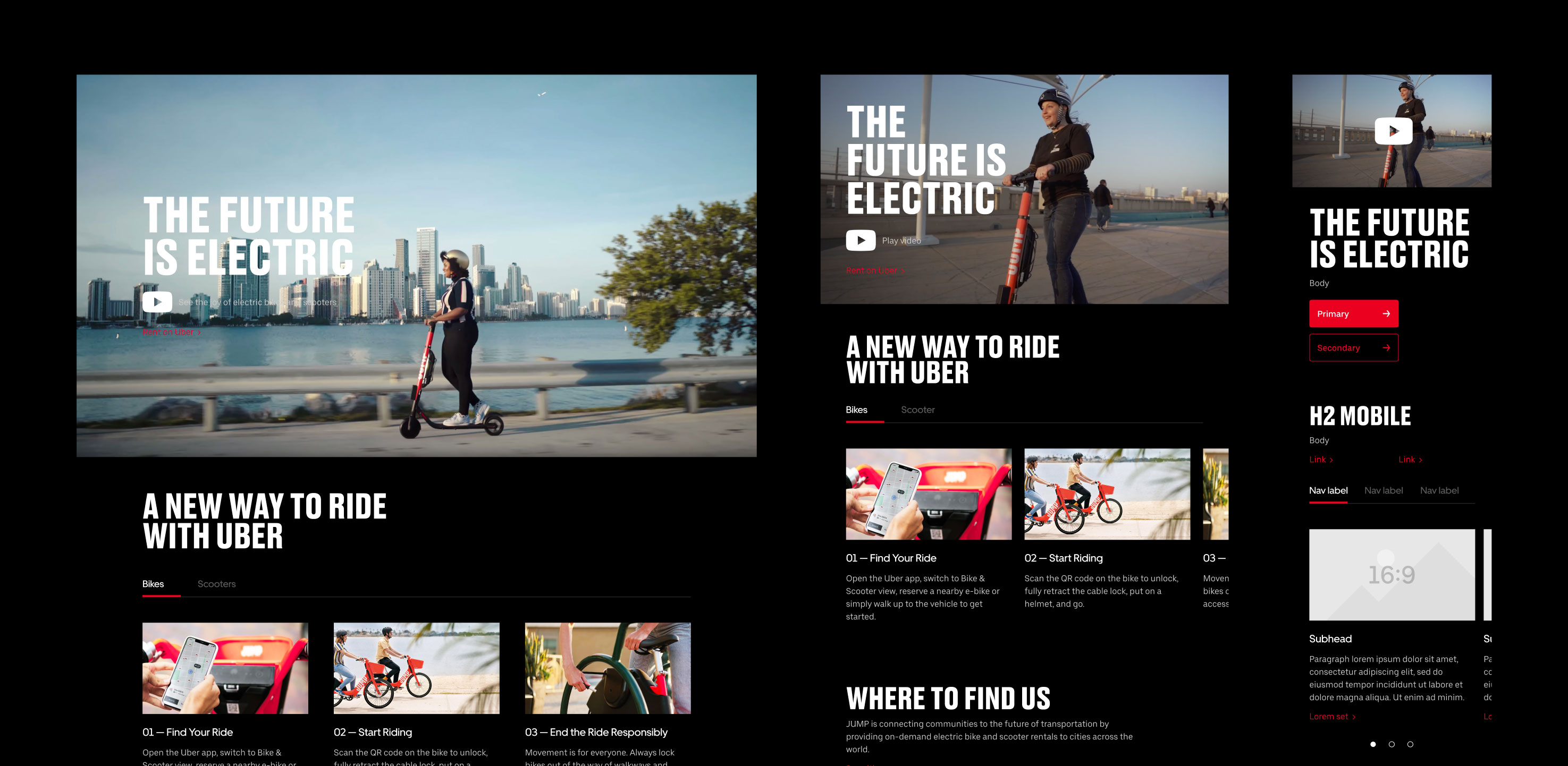
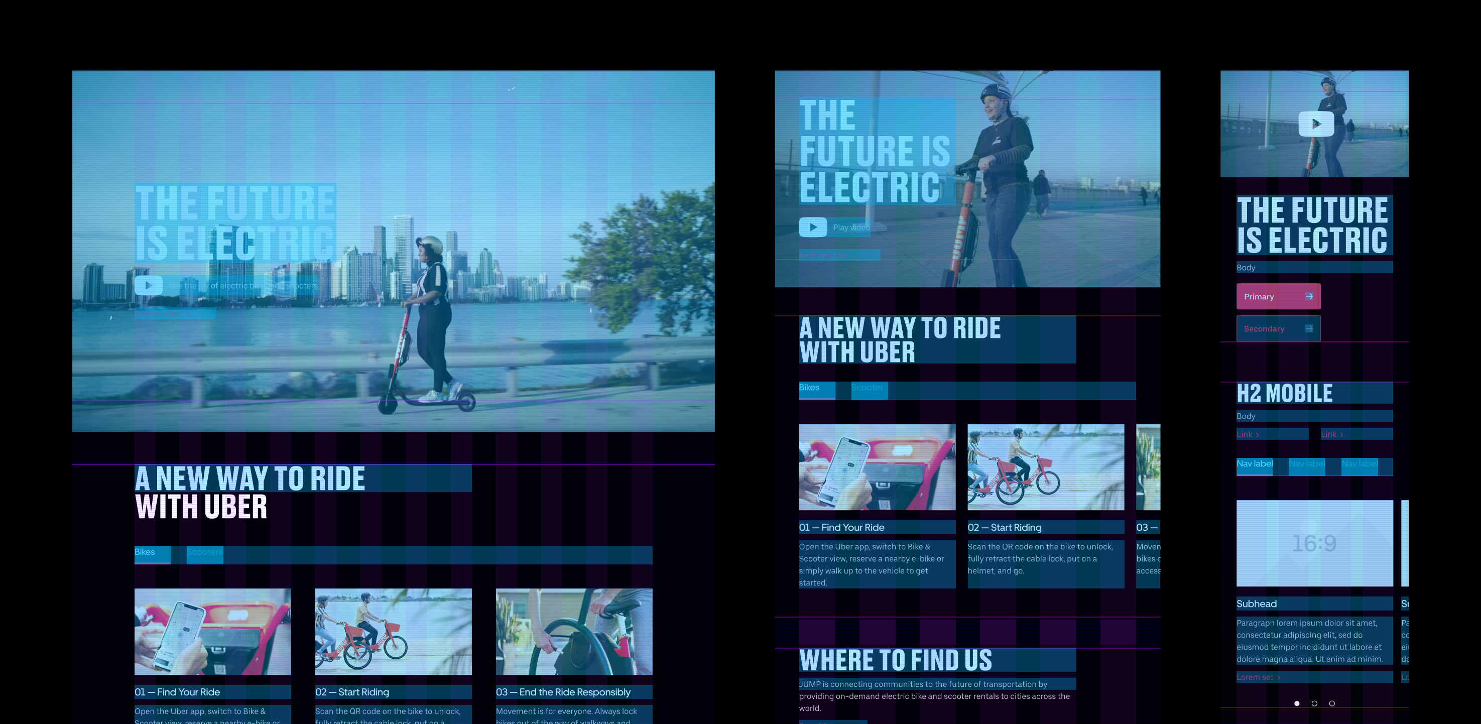
JUMP home template
Grid