Client
Foursquare
Date
07/2018
Tools
After Effects
Illustrator
Sketch
three.js
Cinema4D
Role
A site highlighting Foursquare's pivot from just consumer facing apps, to a suite of enterprise-grade location intelligence tools and services.
Homepage • Prototyped and built using three.js
Overview
Foursquare's B2B products focus on monetizing users' anonymized location data so that clients may derive relevant insights. The modern nature of these products makes them often difficult to explain and understand. Our challenge was to build a web property which would properly voice the new direction of the company, and deliver easily digestible explanations of our products.
Approach
Design an over arching experience that highlights Foursquare's departure from light hearted consumer facing to a trustworthy, future-facing B2B location intelligence partner. We acheived this by enlisting a darker color theme, adopting a more elegant style accross visuals, and creating engaging micro-ineteractions.
In order to ensure our offers were clear and succint, I created a visual style that would overlay our otherwise invisible technology over real world scenarios. By visually depicting how our location tech works, I was able to improve overall product understanding.
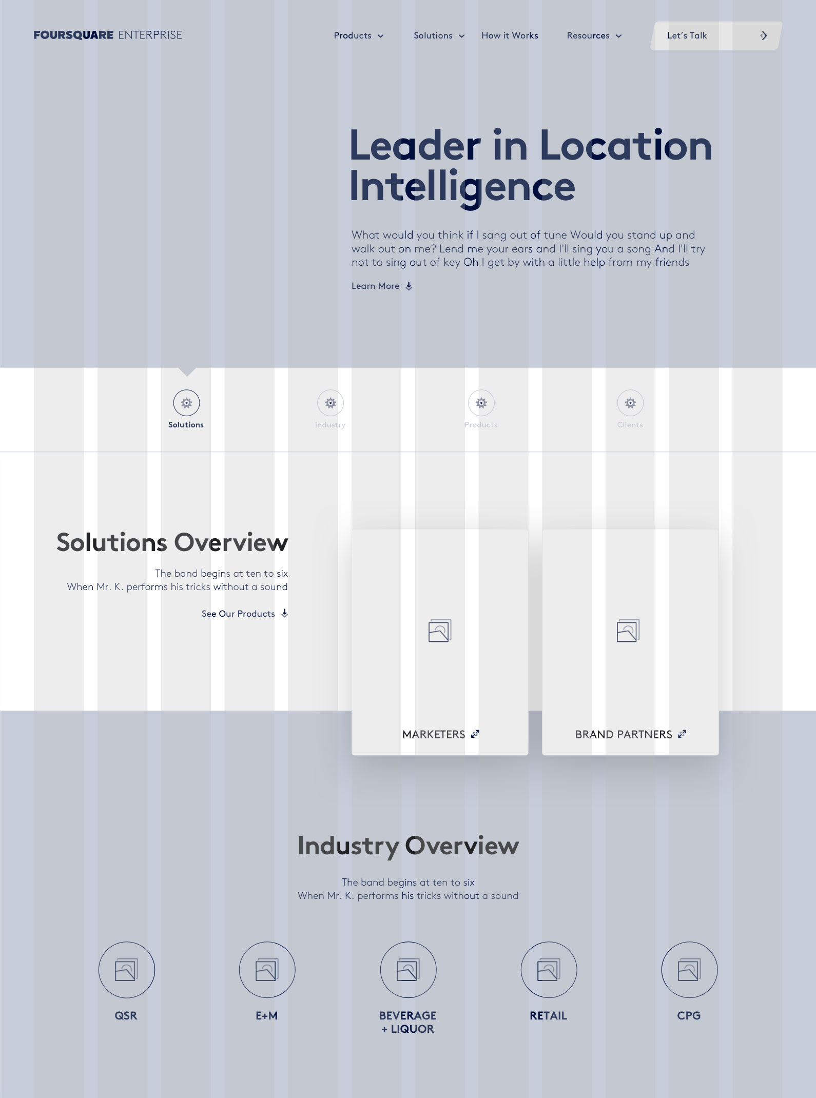
Home sub nav exploration 1 • personalized solutions 1
Home sub nav exploration 2 • personalized solutions 1
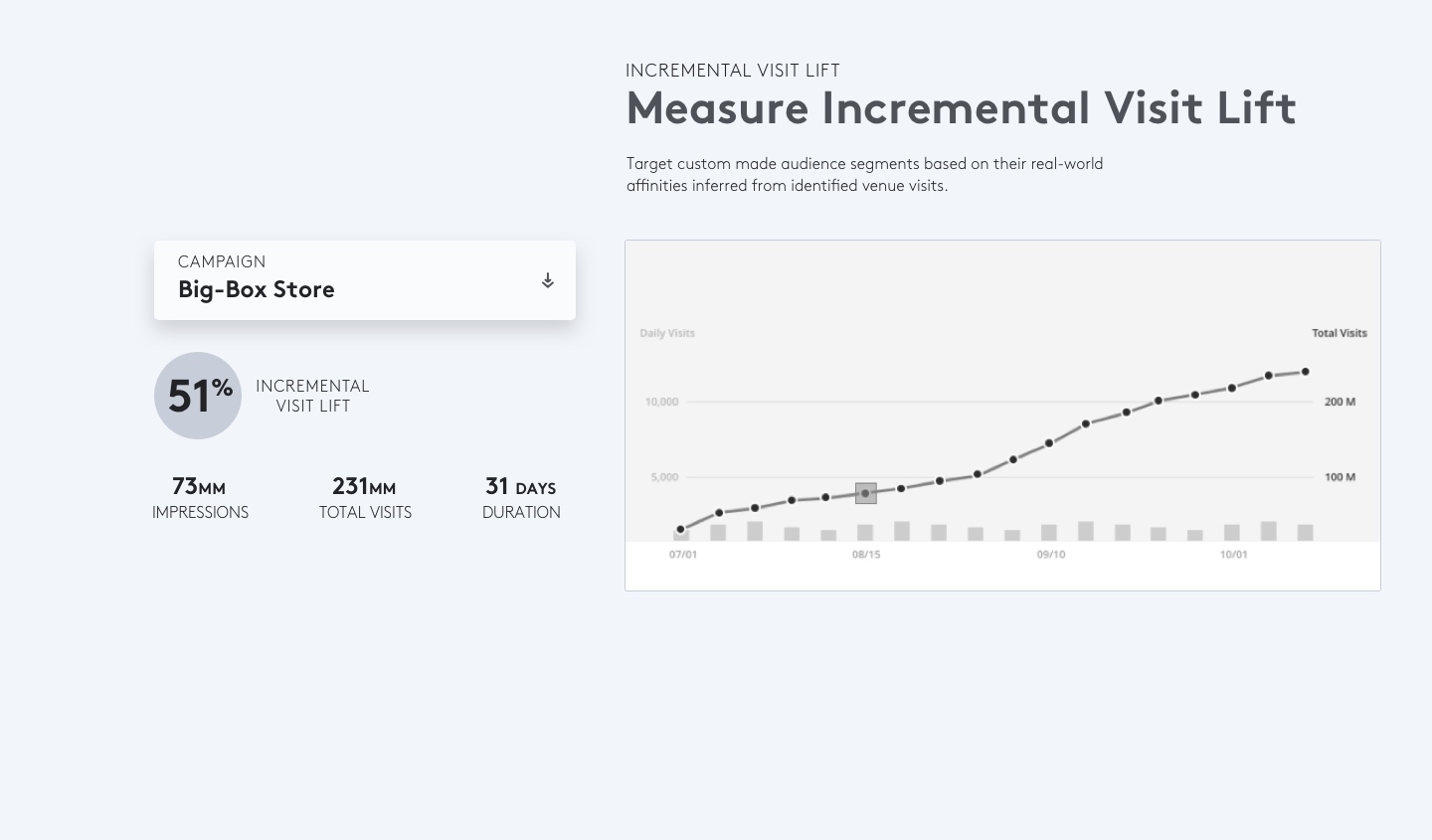
Interactive Attribution component 1
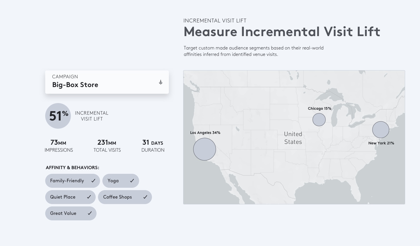
Interactive Attribution component 2
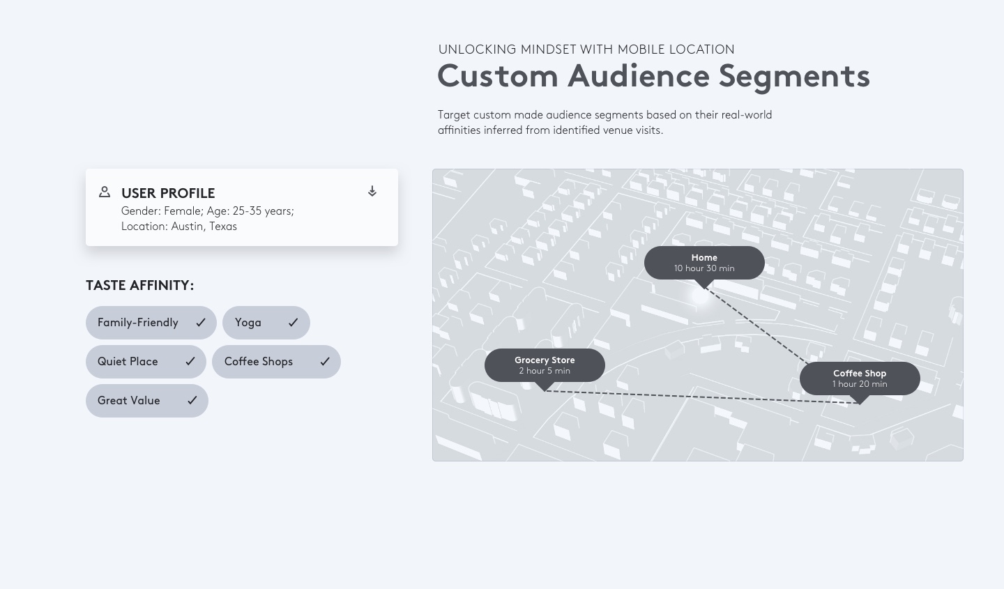
Interactive Pinpoint component
Explorations
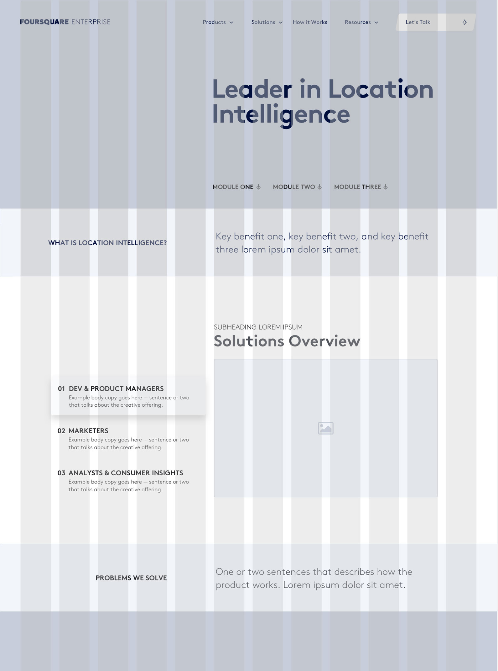
Wireframe explorations allowed me to experiment with different interactions and methods of breaking down & delivering our offerings in the appropiate hiearchy, as well as determine possible interactive ways of teaching our products' core functionalities.
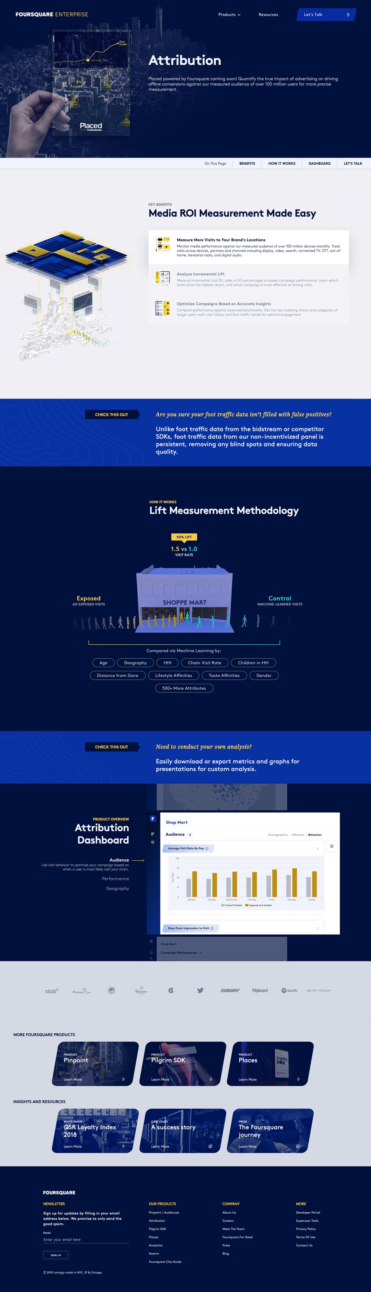
Attribution product page

Pinpoint product page
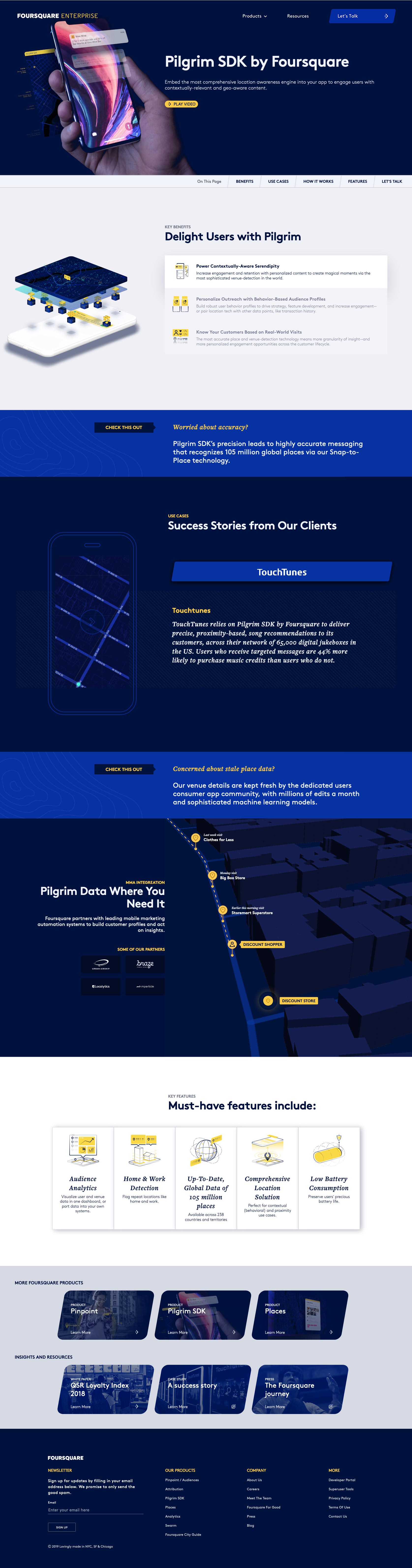
Pilgrim SDK product page

Mobile product pages
Product Pages
Each product page is opened with a straight to-the-point hero conveying the purpose of the product. It is then followed by key features, methodoloy and benefits. This gradual reveal of relevant information allows the user to quickly understand what the product is, how it works and if it will serve their particular need.
Interactive product key benefits component
Hover to view animated states
Micro Interactions
By thinking about the delivery of complex, jargon-filled product descriptions as more than just text, I was able to design and illustrate interactions that increase user engagement and in turn aids their understanding of what they're reading.
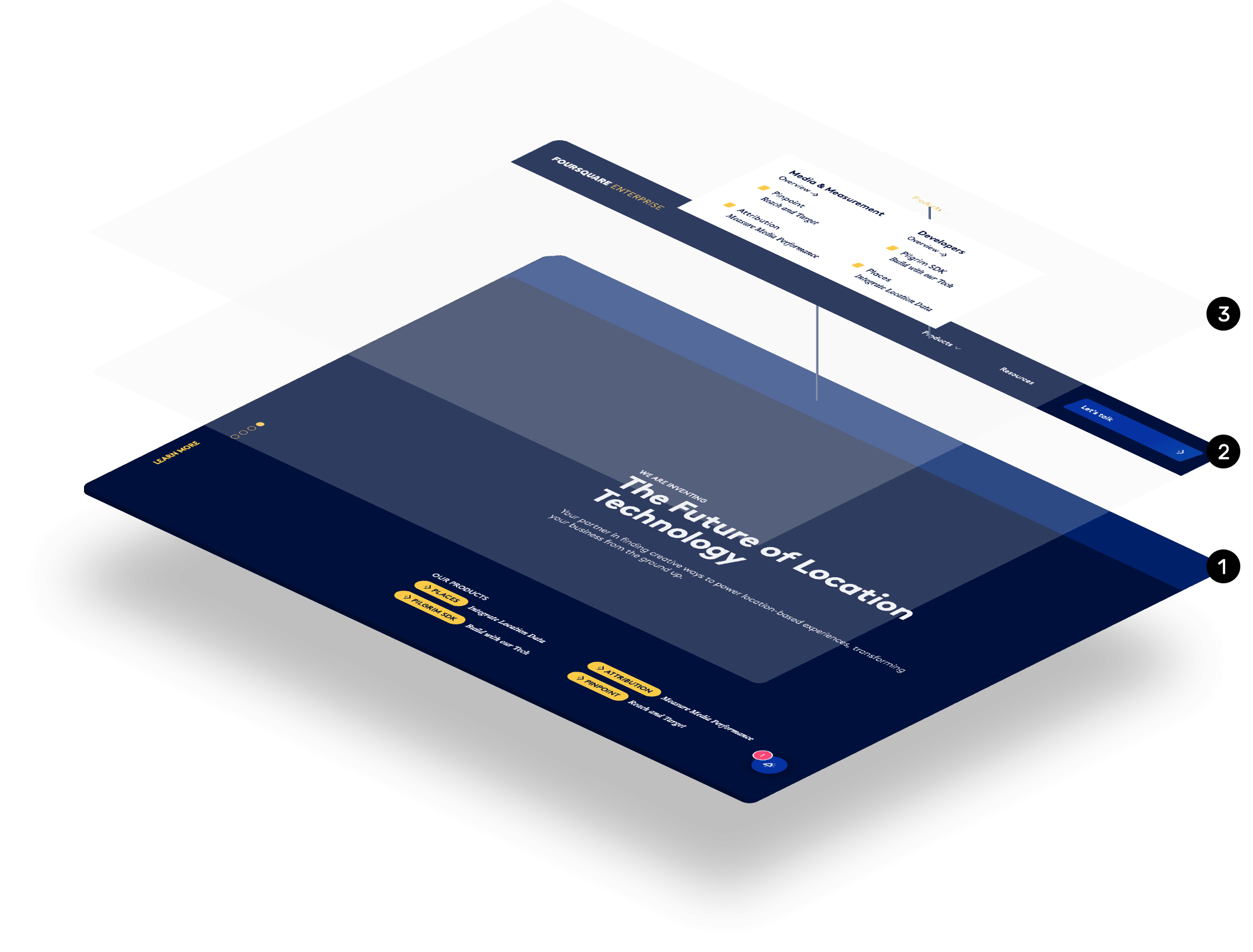
Nav bar and menu
1 Sticky Nav 2 Focused options 3 Options + descriptions
Re-thinking the menu
I wanted users to be able to have a basic grasp of of what they were clicking on before having to actually visit a separate page. This was acheived by foregoing the traditional list style menu for one that has a short description of each product.
Email newsletter overlay